
Decoding Color Psychology for Urban Container Design
When selecting materials for your small urban garden pots, we are not merely choosing a vessel; we are initiating a visual dialogue with the environment around it. The choice of container color directly manipulates the perceived vibrancy and psychological effect of the flora placed inside. We observe that the interaction between the physical medium—the paint or glaze of the pot—and the light spectrum hitting the plants creates an immediate, subconscious impression. Understanding this mechanism allows us to engineer specific aesthetic outcomes rather than relying on simple personal preference alone.
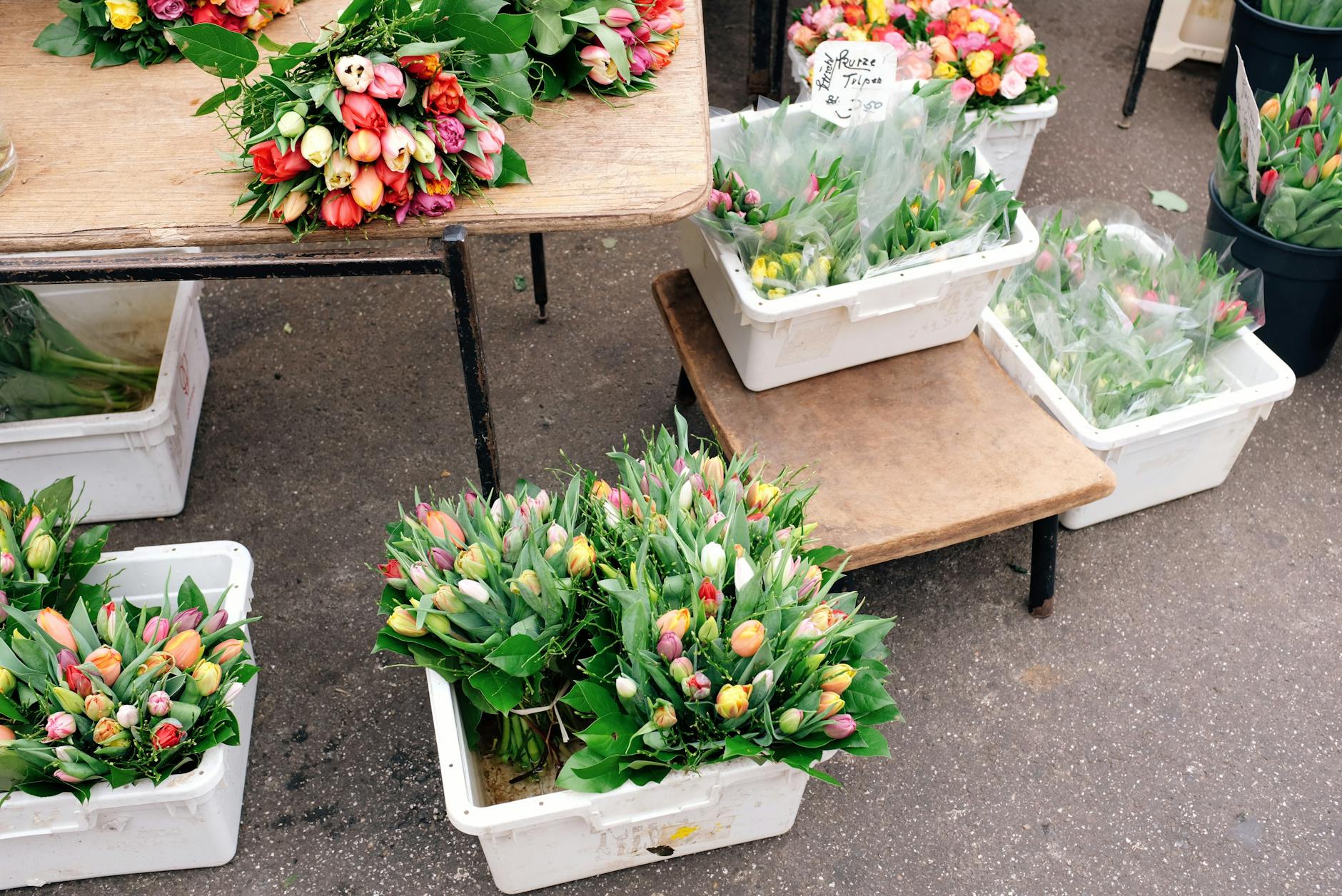
The principle of color theory dictates that complementary and analogous schemes create dynamic visual tension; these pairings make the subject pop forward in a cluttered urban setting. Conversely, monochromatic palettes establish serene, unified fields, offering a sense of calm necessary for smaller spaces. We see this effect consistently when designing container flower arrangements where the goal is to draw the viewer’s eye immediately to the bloom itself.
The Impact of Warm Tones on Perceived Space
Warm colors, such as terracotta reds, burnt oranges, and deep yellows, possess a property that visually advances the surface they occupy. This phenomenon occurs because these hues mimic natural elements associated with warmth and sunlight exposure. In practice, using warm-toned containers makes even modest pots appear larger and more substantial than their physical dimensions suggest. This effect is particularly beneficial in dense urban settings where visual space is at a premium.
Consider the psychological association; these colors stimulate feelings of energy and welcome, which aligns well with the vitality of growing plants. When designing a container flower arrangement using these tones, we achieve an immediate sense of invitation. The contrast against cool greens enhances this effect, creating a vibrant juxtaposition that anchors the arrangement effectively against concrete or muted architectural backdrops.
Cool Colors and Creating Depth in Small Spaces
Cool colors—blues, greens, and purples—operate through recession; they make surfaces appear to recede into the distance. This is a crucial mechanism when managing the visual density of a small balcony or patio. Employing cool tones for your container flower arrangement creates an illusion of depth, effectively expanding the perceived volume of the planting area.
We analyze how this functions in tight urban environments. A deep teal pot, for example, absorbs light slightly, creating a grounding effect that prevents the arrangement from feeling overly aggressive. This technique allows multiple pots to coexist without overwhelming the visual field. When implementing techniques like Vertical Gardening, Maximize Yields on Your Balcony, where space is vertically constrained, utilizing cool colors helps manage the perceived bulk of the planting area effectively.
Materiality and Texture in Container Flower Arrangement
Beyond simple hue manipulation, the tactile quality of the container material dictates a significant portion of the visual experience. The texture—whether smooth ceramic, rough terracotta, or matte glazed—interacts with light to modulate color perception. A highly reflective, glossy surface disperses light broadly, emphasizing the saturated color. A matte finish absorbs light, creating softer edges and emphasizing the organic texture of the plant matter.
This textural interplay is essential when constructing a successful container flower arrangement. Rough, earthy textures like unglazed terracotta connect the arrangement directly to the soil and the natural cycle of growth. This tactile link fosters an immediate sense of authenticity. Conversely, smooth, sleek modern materials offer a clean, minimalist aesthetic that emphasizes the architectural lines of the urban setting.
Glazes, Sheens, and Light Interaction
The specific finish applied to a container acts as a filter for the colors within it. A high-gloss glaze amplifies the intensity of the pigment, making the chosen color appear richer and more saturated. This is effective when you intend for the pot itself to be a focal point, demanding attention through its reflective quality.
When arranging flowers in containers, we must account for the light source. Direct, harsh sunlight will reveal subtle imperfections and texture variations more intensely than diffused light. Therefore, for arrangements intended for continuous viewing, matte or semi-matte finishes often provide a more stable, pleasing visual experience that minimizes distracting specular highlights. We find that this subtle control over reflectivity elevates the entire container flower arrangement from simple planting to deliberate design.
Strategic Arrangement: Mastering Composition within Constraints
Designing an effective container flower arrangement in a small urban space requires moving beyond random placement and applying intentional compositional rules. Since physical space is finite, every element must serve a structural purpose within the overall visual geometry. We analyze how negative space functions as an active design tool rather than mere empty area.
The principle of grouping dictates that clustering similar colors or textures creates visual unity. Mixing disparate elements can lead to visual chaos; therefore, establishing a cohesive color story is paramount when executing your container flower arrangement. Think about the relationship between the foliage and the bloom itself. The leaves should frame the flowers, guiding the eye toward the focal point.
Utilizing Scale and Repetition for Impact
Scale manipulation is critical in small settings. Using a few, larger pots often achieves greater impact than overcrowding a surface with many tiny vessels. This strategy allows each container to breathe and command attention independently. Repetition of a specific color or texture across several pots establishes rhythm, linking the individual elements into a single cohesive composition.
We observe that when dealing with vertical space, repetition in height creates strong visual lines. If you are utilizing Vertical Gardening: Maximize Yields on Your Balcony, consider using containers of varying heights to create an engaging, layered effect rather than a monotonous stack. This layering adds complexity and dimension where physical area is limited.
The Psychological Flow of the Arrangement
The arrangement itself should guide the viewer through a specific psychological flow. Start with the strongest color or texture at the point of entry—the most visible side of the pot. Allow the eye to naturally drift across the arrangement, observing how the colors transition from warm to cool, or from dense foliage to open bloom. This deliberate progression transforms the viewing experience into an intentional journey.
When considering Balcony Bounty: Maximize Yields with Container Gardening, remember that the arrangement is not static; it is a living composition that evolves with the season and the plant’s growth cycle. The color scheme should harmonize with the current state of the plants, ensuring that the visual harmony remains dynamic rather than fixed. We are managing light, texture, and color to create an experience that feels both lush and thoughtfully curated within the constraints of the urban environment.
Tags: urban gardening, container gardening, flower arrangement, color theory, small space design, potting tips, garden aesthetics
Featured Image by ready made on Pexels.