
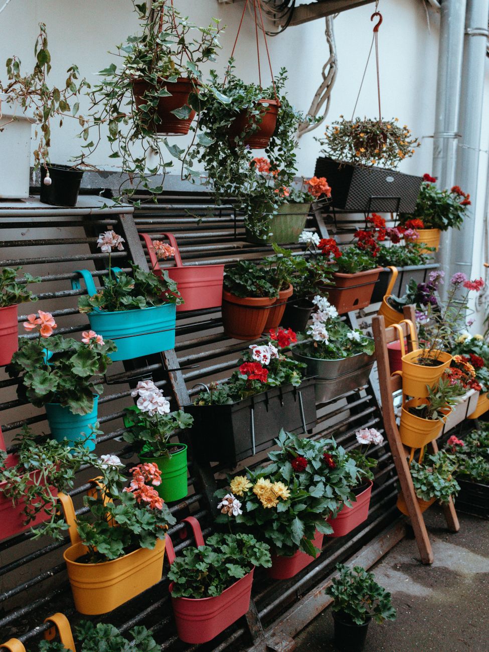
The Psychology of Palette: Applying Container Color Theory to Urban Spaces
When designing a small urban garden on a balcony, you are not simply arranging plants; you are manipulating visual perception. We observe that the choice of container color directly influences how the eye processes space, perceived depth, and the overall emotional resonance of the gardening experience. Understanding container color theory provides a framework for intentional design rather than random placement.
The mechanism at play involves light interaction and psychological association. Colors absorb and reflect light differently, altering the perceived volume of an area. A deep, dark blue, for instance, tends to recede visually, making a balcony feel deeper and more enclosed. Conversely, lighter, pale shades push the visual plane forward, creating an illusion of expanded space where actual square footage is limited. This principle is fundamental when working with restricted urban environments.
Understanding Color Temperature and Spatial Perception
The temperature of a color—whether warm or cool—also plays a role in this spatial manipulation. Warm tones, such as terracotta or deep oranges, generate a sense of warmth and immediacy. They draw the viewer’s focus inward, suggesting closeness. Cool tones, like blues and greens, evoke a sense of distance and calm. When arranging pots, we can use this contrast to intentionally guide the viewer’s gaze across the balcony.
We see that placing warm-toned containers near cooler ones creates dynamic tension. This juxtaposition prevents the arrangement from feeling monolithic or static. Consider how this relates to plant health; plants respond subtly to these environmental cues. A well-balanced color scheme supports a more relaxed viewing experience for the gardener and the observer alike.
Applying Color Schemes for Visual Impact
The goal in small spaces is to maximize visual impact without introducing clutter. This requires strategic application of contrast. Monochromatic schemes, using variations of a single hue, offer a sophisticated, unified look. However, they risk becoming visually flat if not executed with varying textures or finishes. A more dynamic approach involves complementary or analogous color pairings.
Complementary colors, situated opposite each other on the color wheel (like blue and orange), create the highest level of visual vibration. Using these sparingly in small containers allows one specific element to command attention effectively. Analogous colors, sitting next to each other, create harmonious transitions that feel inherently restful. We can use this knowledge when planning how plants will interact; for instance, grouping plants with similar hues creates an organic flow.
Materiality and the Color-Space Interaction
Color is only one variable in container design; the material itself interacts critically with the chosen hue. The finish of the ceramic glaze, the texture of the terracotta, or the sheen of a painted metal all modify how light plays across the surface. A high-gloss finish reflects more ambient light, making bright colors appear more luminous and energetic. A matte, earthy tone absorbs light, lending a grounded, rustic quality to the arrangement.
When considering container color theory, we must also account for the physical reality of the medium. The visual effect is amplified by the tactile experience. A smooth, cool blue pot feels distinctly different from a rough, porous terracotta pot, even if both are painted the same shade. This sensory layer deepens the connection between the viewer and the garden space.
Designing for Specific Balcony Scenarios
Different balcony setups demand different color strategies based on the prevailing light conditions. South-facing balconies receive intense, direct light throughout the day, necessitating colors that can handle high luminosity without appearing washed out. Here, saturated jewel tones perform well, offering richness against the bright exposure.
North-facing or heavily shaded areas require colors that mimic light where it is scarce; muted greens, soft grays, and deep, cool blues establish a tranquil atmosphere. In these environments, overly bright colors can feel jarringly artificial. We must adapt the color palette to reflect the available ambient illumination, optimizing the mood for relaxation, whether you are focusing on cultivating herbs or maximizing aesthetic appeal.
Integrating Color with Botanical Content
The final layer of application involves aligning the container’s hue with the plant material within it. This synchronicity enhances the intended effect dramatically. For example, using deep, rich browns or dark charcoal containers accentuates the vibrancy of green foliage, making the plants appear more saturated and intentional. When pairing vibrant flowering annuals—say, bright reds or yellows—with muted gray pots, the flowers become the undisputed focal point, an intentional burst of life against a serene backdrop.
This thoughtful integration ensures that the color theory serves the botanical goal. Think about how this visual arrangement supports your yield goals. If you are focusing on maximizing flavor and harvest from your small space, ensuring adequate light distribution through strategic container placement becomes just as crucial as selecting vibrant plant varieties. For optimizing growth potential, remember that water management is equally critical; understanding how containers interact with soil moisture informs the entire system. You might find that grouping certain types of plants together helps regulate local humidity, which can indirectly support robust growth when you are focusing on things like Balcony Bounty: Maximize Flavor & Yield on Small Balconies (https://twigharbor.com/balcony-vegetable-gardening-maximize-flavor/).
The process demands experimentation. Observe how the light shifts throughout the day across your chosen arrangement. Adjustments made based on real-world observation refine the abstract rules of color into tangible, functional design decisions. Container color theory is not a set of rigid rules; it is an analytical tool for engaging with the physics of light and the psychology of space in a confined urban setting.
Tags: urban gardening, balcony design, container color, small space gardening, flower arrangement, gardening tips, plant design
Featured Image by Kris Møklebust on Pexels.